GO
Sorry, but you already have a basket with that name. Please use something else.
Are you sure you wish to delete this basket?()
This action cannot be undone.
Sorry, something went wrong
Please report the problem here.
How to revamp your library with colour psychology: 5 popular design palettes from our interior designers
April 16th 2026
If you're looking to redesign your library or classroom, one of the most effective and simple ways is to choose a colour palette. Not just pleasing on the eye, stylish colour schemes have also been scientifically proven to have emotional and behavioural benefits for children and teens.
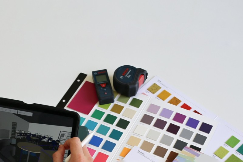
Senior Interior Designer Helena takes us through how to pick a colour palette and apply it to a school or community space. We've also picked out 5 example colour schemes our interior designers use regularly to inspire your own modern library design. Want to see your ideas realised in your school or library? Get in touch with our team and start your design journey.
How to choose the right colour palette for your library or reading space
To choose a colour palette for a library or reading space, Helena recommends using at least three key colours for your scheme.
- A main mid-toned colour which acts a base to your interior.
- A deeper colour to add depth into the space. This color can be a deeper monochromatic shade of colour 1, or a dark contrasting colour. The deeper colour is perfect for creating cosy corners.
- A lighter colour than both 1 and 2. This could be a complementary colour in your palette which can be used for contrast, adding a pop of colour and drawing attention to key areas in the library or reading space.
To add more colours to your palette but reducing over-stimulation, select monochromatic shades or analogous colours for your chosen base colours.
To effectively apply your chosen palette, aim for a cohesive look with pops of colour around the space to create visual interest. Let's take a look at Helena's palette examples for more inspiration!
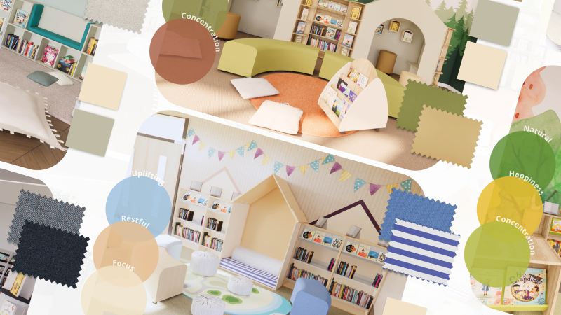
5 palettes to try in your library, reading space or classroom |
|
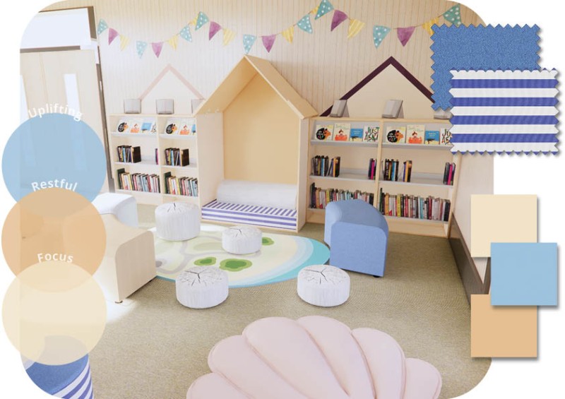
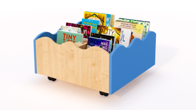
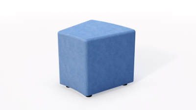
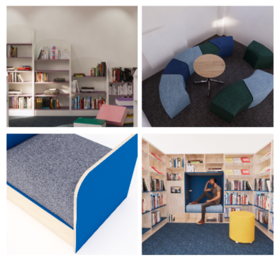
1. CoastalUse a palette of soft coastal blues and sandy neutrals to evoke a serene seaside retreat in your reading and learning space. Blue is associated with trust, relaxation and tranquility. Connecting students to the sky, sea and ocean, it could also help us to think more creatively, with one study by the University of British Columbia finding that blue can enhance performance during a creative task. For a flash of fun in this coastal palette, incorporate sailor-striped cushions in navy, aqua and cream. Alternatively, explore our Coastal range of furnishings and accessories to create a beach-themed reading haven. Try these furniture ideas:
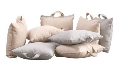
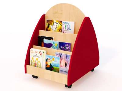
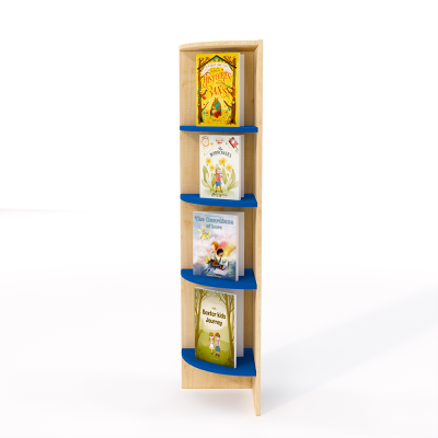
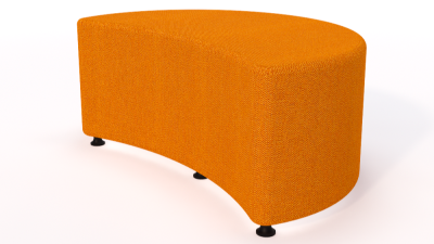
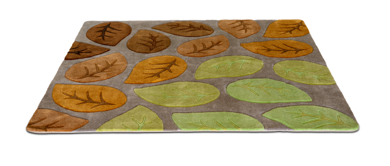
2. EarthyGround your library or classroom in a palette of warm earth tones which evoke the comforting, cosy side of nature and welcome students in. Wooden bookshelves and book displays add natural textures to an earthy palette, helping create that calming, outdoors feel to your library or classroom. Rusty reds and burnt oranges are mood-lifting colours that can also aid memory and critical thinking. Try these furniture ideas:
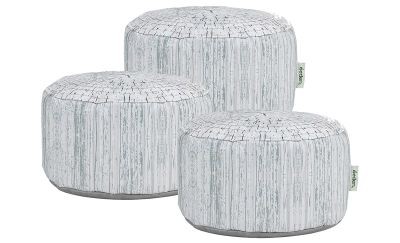
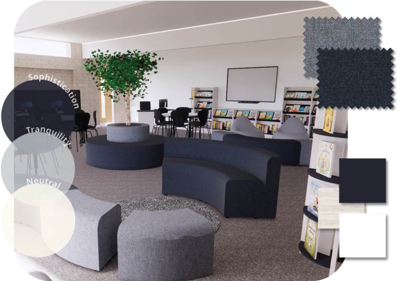
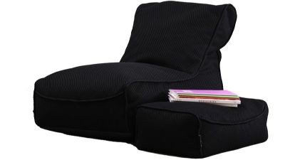
3. MonochromeFor a modern library design palette that adapts to plenty of styles, try a combination of dark blues, greys and off-whites. A monochrome palette offers a clean and sophisticated look and promotes unity and focus in your learning space. While it may have an unfair reputation for being dull, grey is both reliable and neutral. This makes it a great choice for non-confrontational areas, or as a background colour to draw visitors' attention to enticing book covers or comfy seating. Including dark colours like navy are ideal for reducing visual stimulation and creating focus areas for quiet reading and study. Top tip: Darker colours are also a great option when it comes to seating, because as well as being visually appealing, your library needs to be functional too! If you're looking for inspiration for secondary schools, we dig deeper into the colour psychology for older settings in our dedicated blog, and explore the colour choices in one of our installed secondary school libraries. Try these furniture ideas:
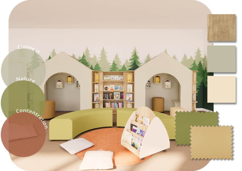
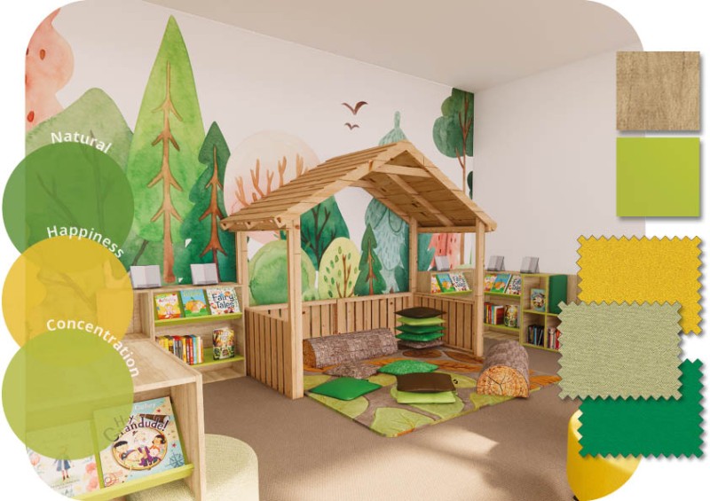
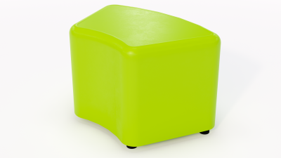
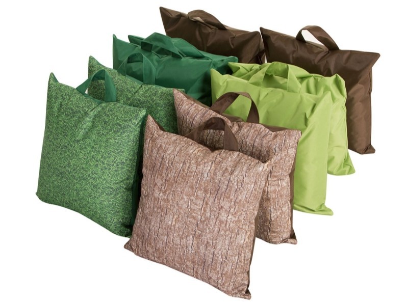
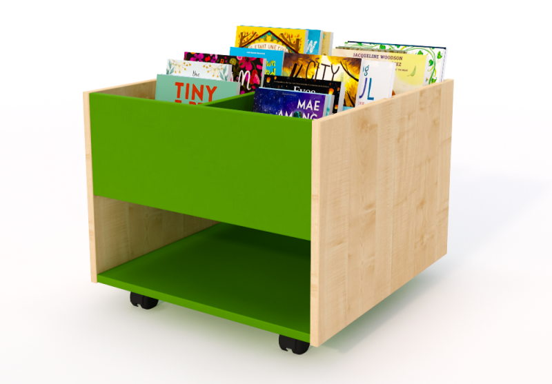
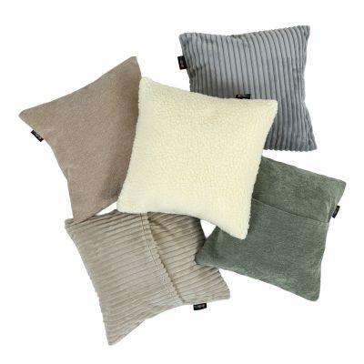
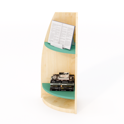
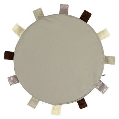
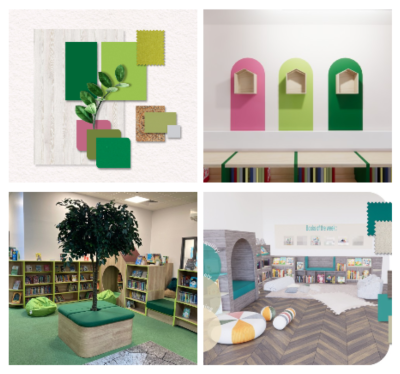
4. NatureReduce stress, increase creativity, and improve overall wellbeing with a nature-themed palette of greens and yellows. Popular with primary schools and public libraries, a nature palette brings the outside world in and helps visitors connect with the outdoors whilst reading and learning. Yellow is ideal for promoting a positive environment and is also though to help with memory, analytical thinking, and decision-making. And there are few more eye-catching colours than green! Fresh and fun, this joyful shade incorporates the energy of yellow while increasing concentration. We've created a seperate guide to creating a nature-inspired library or reading space, featuring 6 popular accessories for libraries and schools. Try these furniture ideas:
|



 |
 |
 |
 |
Discover more design ideas on our Inspire Me boardExplore more palettes, furniture recommendations, and library layout examples on our Inspire Me board, curated by our interior design team.
|
Your design questions, answered
 How do I choose the right colours for my library or classroom?
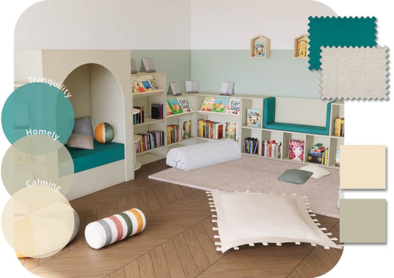
To select a colour palette effectively is all determined by what you wish to achieve in your space. To create a calming neutral interior, monochromatic and analogous colour schemes work well with lower saturated colours, like dusky greens to create muted colour palettes. Spaces dedicated to reading or artistic endeavours are also more suited to softer tones.
If you want an exciting, visually engaging interior, complementary, split-complementary and triadic schemes will create more contrast and intrigue. For group discussions or detailed work, bright colours can encourage mental alertness. Age is also a factor in choosing a palette: while younger children prefer bright colours, they can cause anxiety in older children or adults.
If your colour palette is being used to achieve a visual scheme, for example a ‘coastal’ look, it is important to reference tones from that environment to successfully remind users of a specific place.
It is important for you to assess the environment that you are injecting colour into. Colour choice in a library setting should be used to align emotions and behaviours with the purpose of the space. You should also take into account the age group, surrounding location and type of organisation. For example, school libraries are seen as an extended learning environment, but there also should be elements of play, as this is equally important for the learning and development of children.
 How do I use colour to support neurodiverse children?
With around 16% of children in the UK requiring SEN or EHC support, colour psychology can also be an effective tool for supporting neurodiverse children and teens. Colours like blue and green can help to reduce overstimulation in children with sensory difficulties caused by ADHD or autism spectrum disorders.
Conversely, in schools, classrooms that are too stimulating can lead to increased disruptive behaviour amongst disabled or neurodiverse pupils, including weaker concentration, hand flapping and repeated blinking. One way to combat this is to consider colour wavelengths.
When we create designs for a SEN school or space, we stay away from using too many long wavelength colours (like red and orange) as these could upset the children or trigger certain behaviours. Instead, we would use short wavelength colours (think pastels and blues) to focus and calm the children and create a room or area where they feel safe.
How do I book a library design visit with Peters?
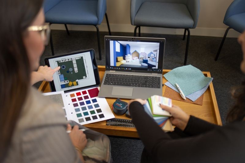
To start the transformation of your library or school environment, book a free design visit through our online form or email us at designservices@peters.co.uk. After the initial visit, you will receive your free, no obligation 3D CAD design and detailed quotation to start your design journey. Peters interior designers will then support you from the initial design, all the way to the installation of your brand new library or reading space.
- hello@peters.co.uk
- 0121 666 6646
- Send a message
- Meet the team
- Peters Ltd
- 120 Bromsgrove Street
- Birmingham
- B5 6RJ